
TYPEFACE TO RECLAIM HISTORY AS A MOMENT
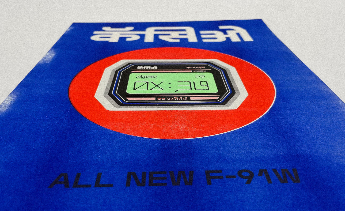
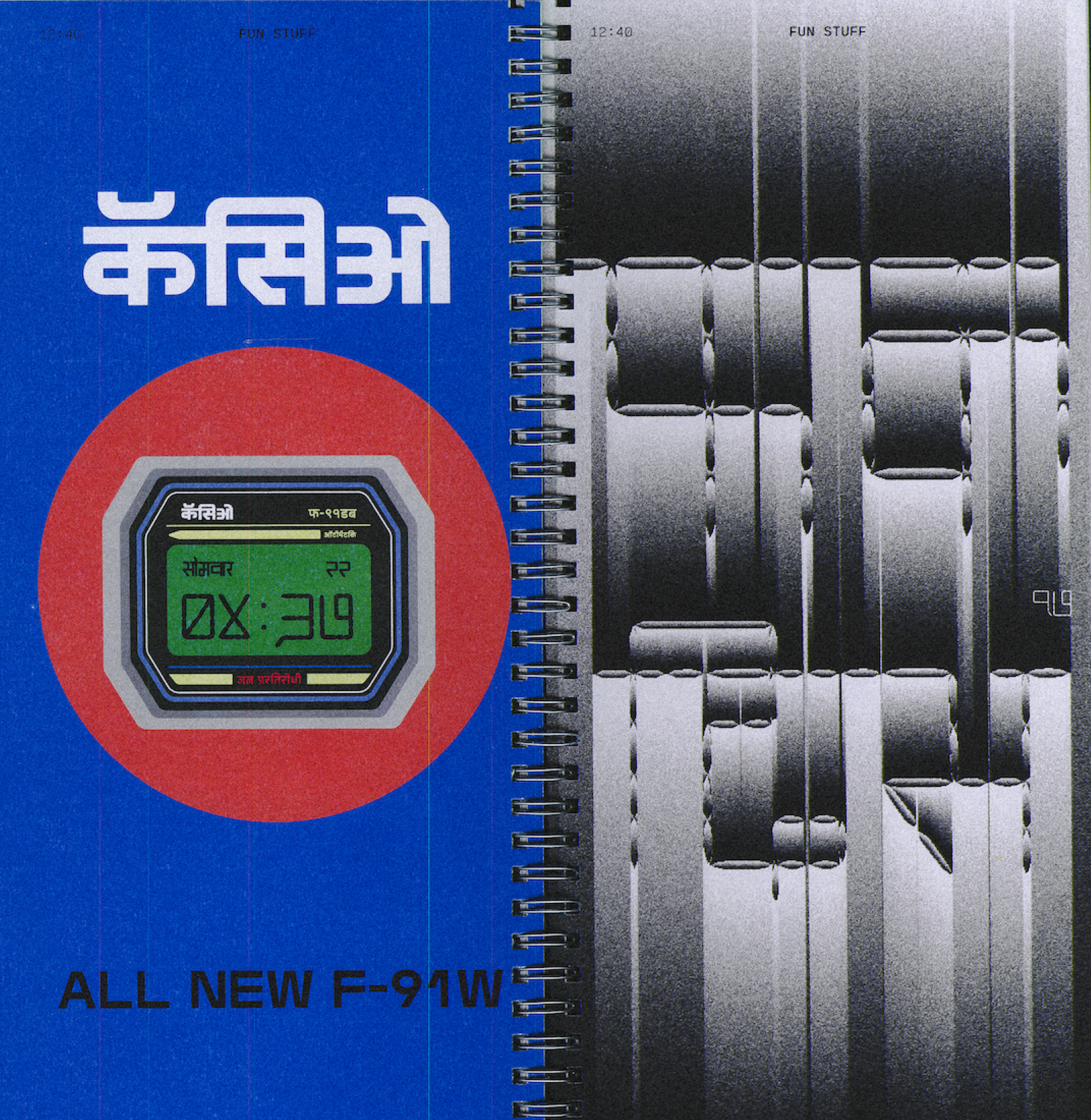
12:40 is a monolinear typeface that unites Latin, Devanagari and Urdu without erasing their individuality. It began with the digital clocks of a Mumbai childhood, whose numbers never spoke in the script, a quiet want, to make one a grandmother could read, that we feel lucky to have built.


Growing up between Mumbai and Bhopal, I was fairly type-obsessed, and I couldn't ignore one thing: there were almost no legible, regionally rooted digital numerals made for Devanagari, the script I grew up surrounded by.
The shop signs had it. The regional packaging had it. Even a humble loaf of Wibs bread in Bombay — wrapped in a Devanagari take on Cooper Black — felt more alive than anything on my computer.
The expressiveness was already there. It just hadn't made it onto the screen.

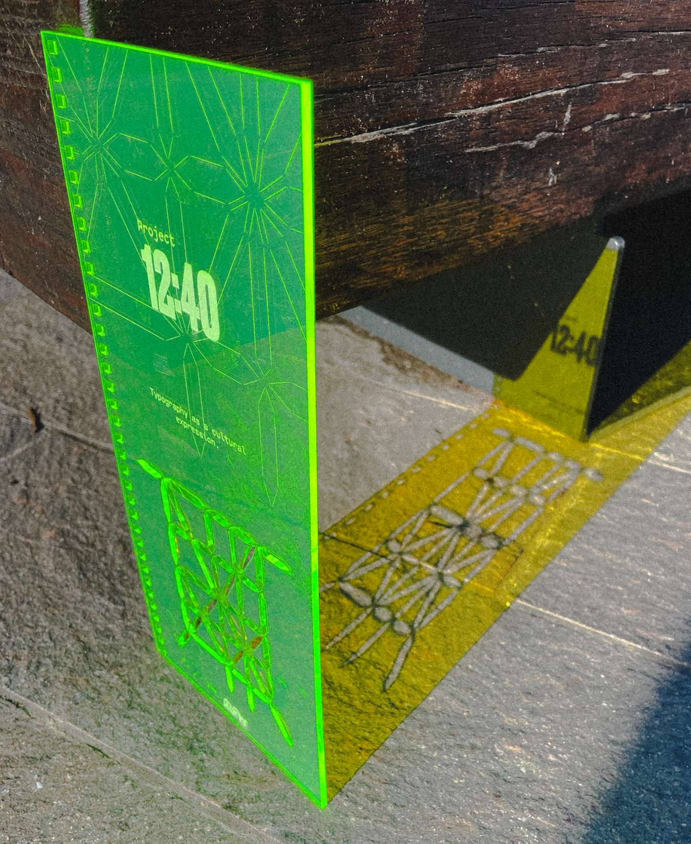
BUILT ON A GRID, NOT BOXED BY ONE
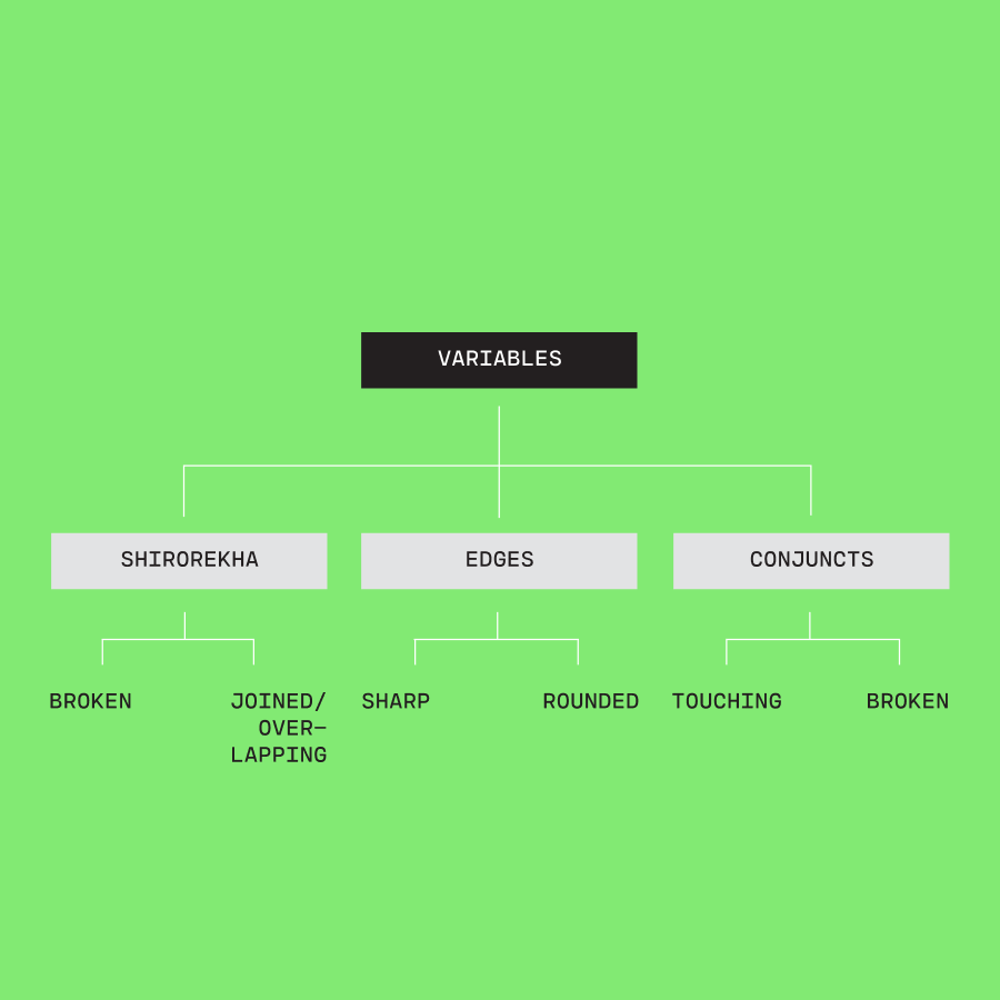
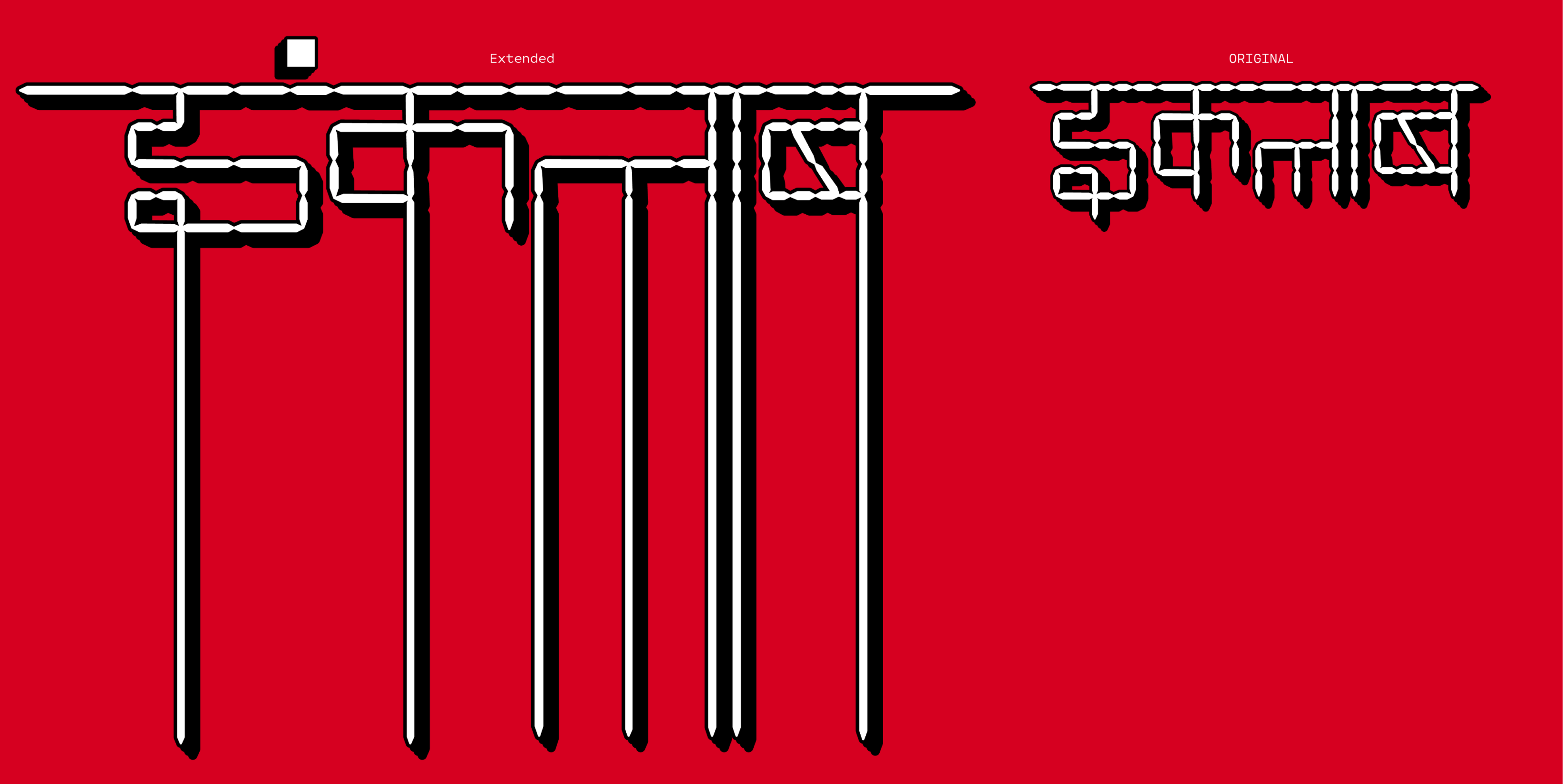
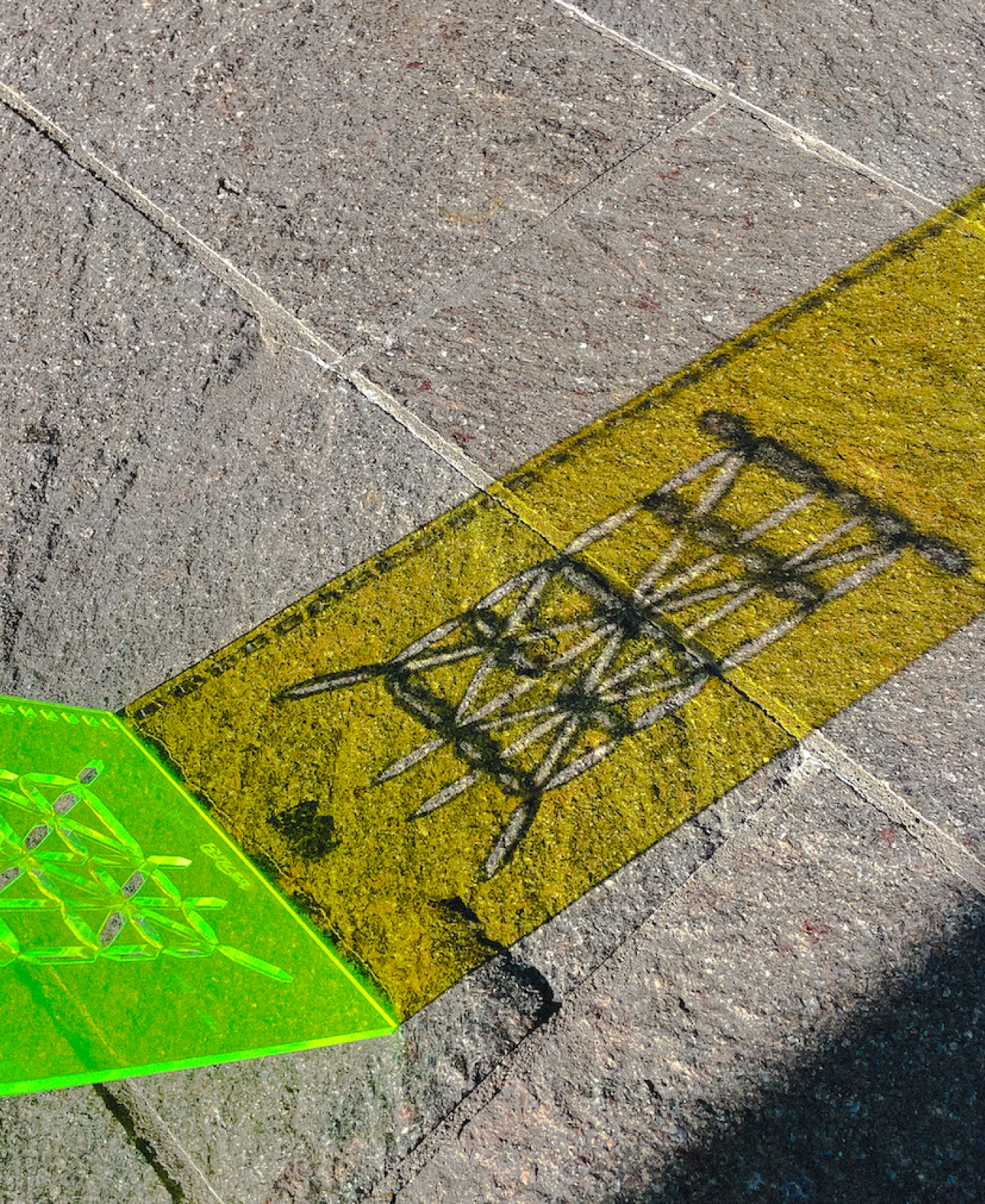
I drew 12:40 as a monolinear, segmented letterset — inspired by old technologies and the early digital displays of my childhood — on a grid that holds Latin, Devanagari and Urdu together without flattening any of them.
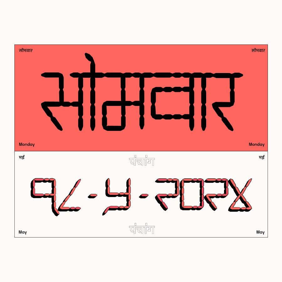
That meant walking a line. Latin runs narrow; Devanagari runs wide and lives mostly off-screen, on busy streetsides. I deliberately broke the śirorekhā — the horizontal headline stroke — in many letters, so the headstroke doesn't fully connect. Figuring out the alternate glyphs while keeping the overall texture readable was the hard part.
The goal was never one system winning over the other. It was knowing which influence to apply, when, and why. I'd always wanted to treat the everyday, lived typography of India with the same seriousness as a Swiss poster.


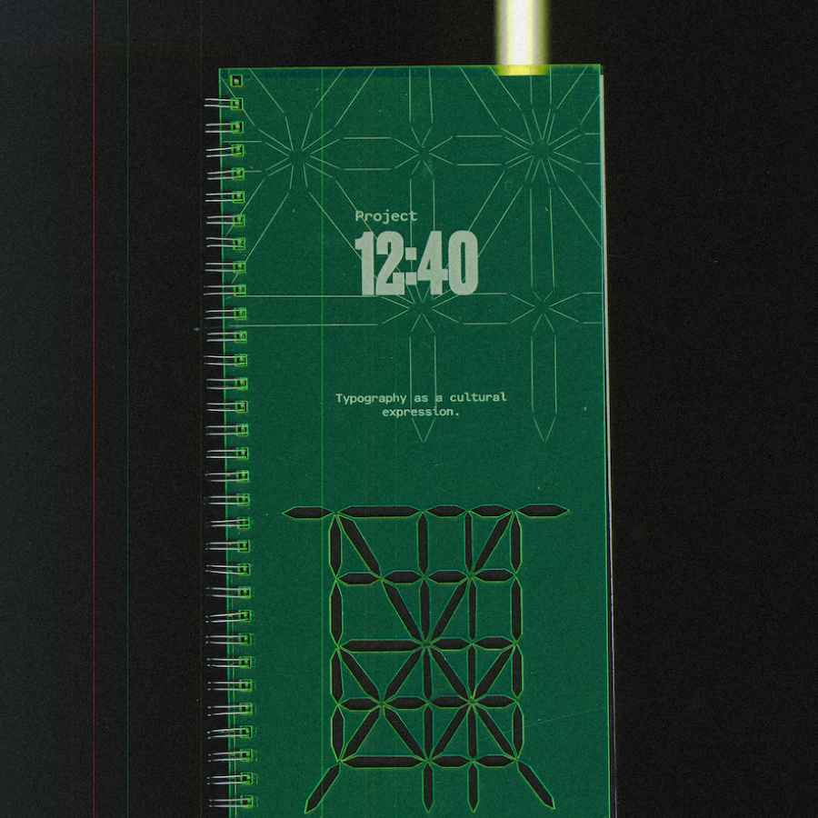
IT NEEDED TO BE HELD, NOT JUST SEEN


12:40 began as a typeface. It didn't stay one.
I made a printed specimen book, because the project needed to live in the physical world — to be held and read, not scrolled past. On a screen, the typeface risks being read as just another digital experiment. On paper, in a book, it feels grounded, contextualised, almost archival.
The book is the artefact. It's how the research survives beyond its digital use.
WHERE IT WENT


In October 2025, 12:40 was featured by It's Nice That.
It started from a quiet want, a digital clock in Devanagari for my grandmother, and grew into a larger exploration of how design can honour many voices at once.
It isn't finished.